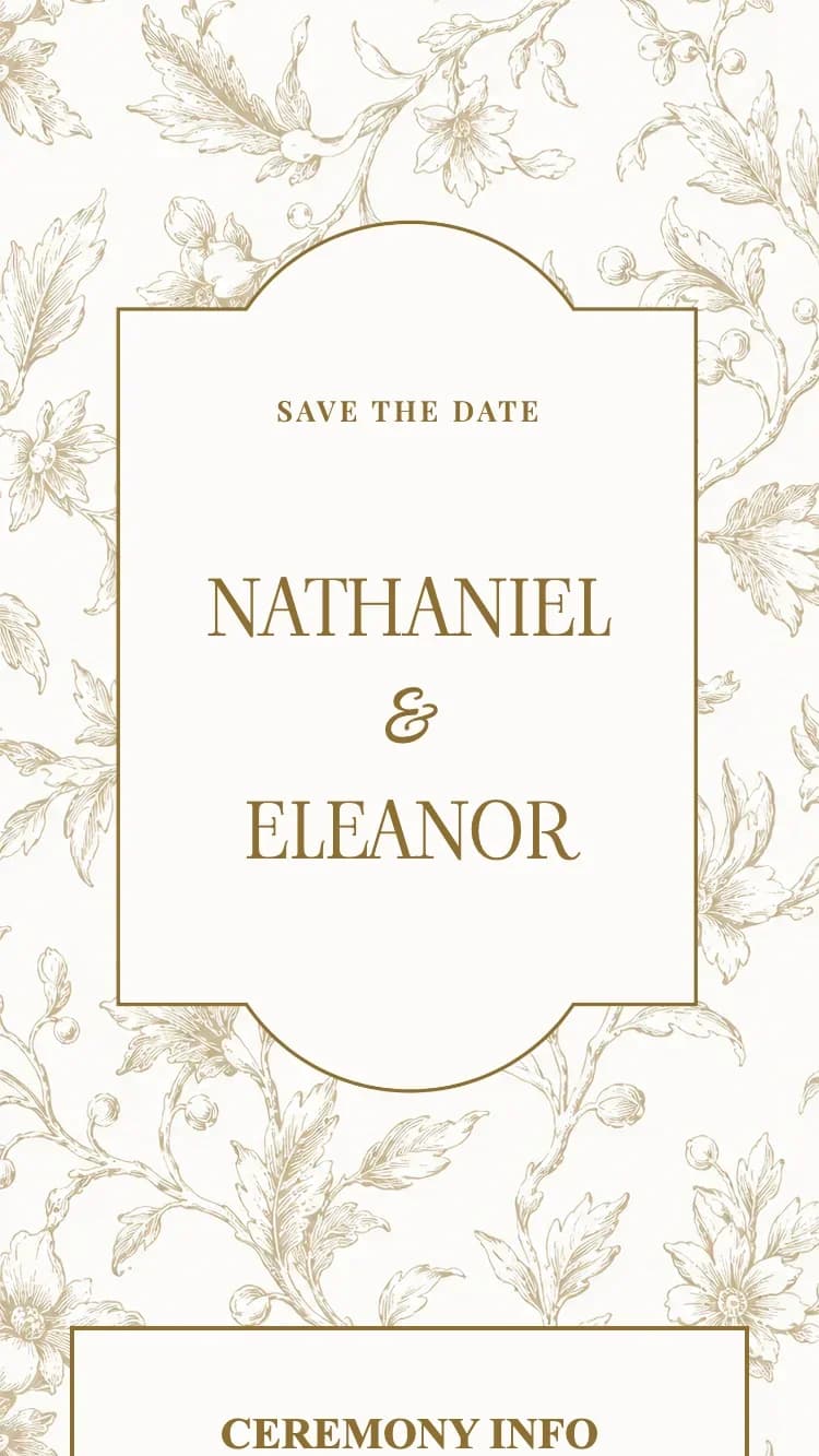
Porcelain Brown Template - Antique Gold Wedding Invitation
Free to create · 3-day trial · Pay only if you love it
Highlights
- Hand-drawn antique gold floral pattern tiling the whole card, perfectly seamless
- Softly arched opening frame outlined in a single fine gold rule
- Cream cards edged in gold that keep every line of type readable
- Warm gold calendar block with a paper grain and a heart marking the wedding day
- Wedding-day timeline with cake, chapel and music medallions
- Matching gift box in the same gold floral pattern
About
The Porcelain - Brown invitation takes its cue from classic toile fabric and old glazed china, warmed into an antique gold palette: daisies, wild blossom, buds and trailing leaves drawn in fine gold-brown linework, repeating across the whole card like the pattern on an ivory porcelain vase.
Cream cards edged with a gold rule float on top of that pattern and carry all of the content. The arrangement keeps the type effortlessly readable even though the ground behind it is dense, and it gives the card the depth of several sheets of paper stacked together.
The clearest difference from the Blue and Red editions is the opening panel: instead of an engraved oval, Porcelain - Brown uses a softly arched frame, curved at the top and the bottom and outlined in a single fine gold rule, wrapping the Save The Date line and the couple's names. The second signature detail is the calendar, a warm gold block with a faint paper grain, white numerals and a bright heart marking the big day.
Every section is included: both families' details, the invitation text, the ceremony and reception blocks, a grid photo album, Google Maps, a dress code, a wedding-day timeline with cake, chapel and music medallions, a guestbook, plus a matching gift box in the same gold floral pattern.
With its antique gold and ivory palette, this is Royal European styling turned quiet and warm, suiting classic weddings, formal receptions, and couples drawn to muted gold and hand-drawn Floral pattern work. If you like the same layout in navy or warm red, see the Porcelain - Blue and Porcelain - Red variants.
Perfect for
Features
- Customizable content
- Unlimited photos
- Google Maps
- Multiple languages
- Guest name display
- Link sharing
- RSVP
- Guest guestbook
FAQ
All three share the same stacked cream-card layout, but Porcelain - Brown changes two things: the palette moves to a muted antique gold on ivory, and the opening panel uses a softly arched frame instead of the engraved oval used by Blue and Red. Pick Brown if you want the same classic pattern work in a warmer, gentler tone.
No. All of the content sits on solid cream cards with a gold rule, so the pattern only shows in the margins and the gaps between cards. Text always sits on a flat cream surface and stays crisp on both phone and desktop.
The calendar is a warm gold block with a faint paper grain and white numerals, and the wedding day is marked with a bright heart. Above it sit the live countdown and the guest-arrival and banquet times, all inside the reception card.
It suits classic weddings, formal receptions, and couples who want a gold card that reads antique rather than bright. The gold-and-ivory palette pairs easily with dried flowers, cream roses, and wood, lace or candlelight styling.
Yes. Porcelain - Brown supports Vietnamese, English, Traditional Chinese, Arabic and more. You can switch on one or several at once; the invitation text, ceremony details and guest wishes all render in the languages you choose.
Related Templates
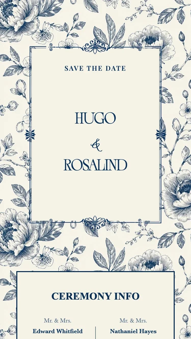
Porcelain - Blue
Blue-and-white toile florals on cream, with an engraved navy frame and a deep navy calendar
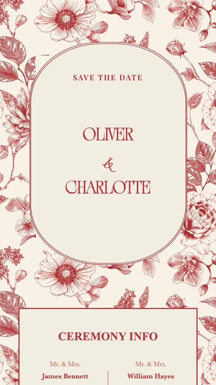
Porcelain - Red
Red toile florals on cream, with an engraved red frame and a deep red calendar
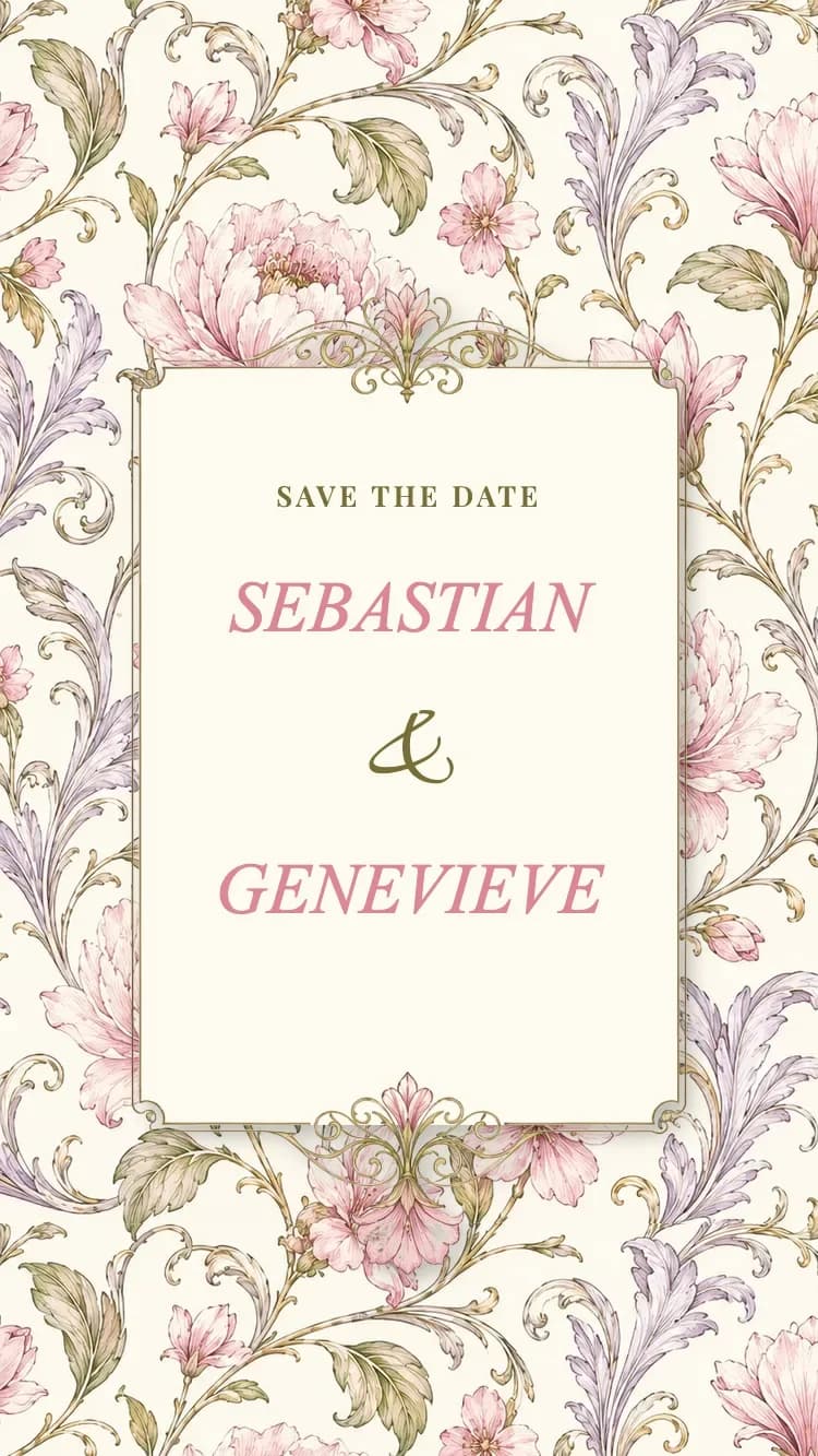
Porcelain II - Pink
Hand-painted pink peony toile on cream, with rounded cards, an olive hairline and a rose calendar

