Porcelain II Pink Template - Hand-Painted Pink Peony Wedding Invitation
Free to create · 3-day trial · Pay only if you love it
Highlights
- Full-colour hand-painted pink peony pattern tiling the whole card, perfectly seamless
- Rounded cream cards edged with a fine olive-gold rule and a soft shadow
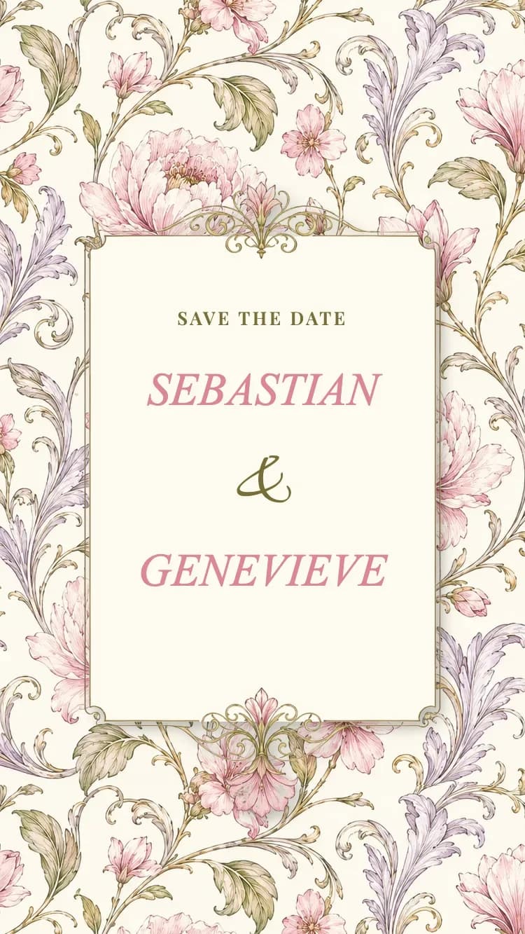
- Engraved gilt frame crowned with a pink lily above and below the names
- Peony sprays tucked against the card edges that drift gently as you scroll
- Rose calendar block with a heart marking the wedding day
- Wedding-day timeline with ring, dove and bell medallions
About
Porcelain II - Pink is the second generation of the Porcelain family. Where the first two variants drew their pattern in a single ink colour, this one uses full-colour painted artwork: peonies, magnolias and wild blossom in soft pink, threaded with olive leaves, gilded tendrils and pale lavender fronds, repeating across the whole card like the print on a length of antique floral cloth.
Cream cards with rounded corners float on top of that pattern and carry all of the content. Each one is edged with a fine olive-gold rule and lifted by a soft shadow, so the type stays effortlessly readable even though the ground behind it is dense, and the card reads like several real sheets of paper stacked together.
The opening panel is an engraved gilt frame, crowned top and bottom with a pink lily, wrapping the intro line and the couple's names set in italic. The signature detail of this version is the pair of full-blown peony sprays tucked against the edges of the cards, drifting gently as you scroll, together with a rose calendar block in cream numerals with a heart marking the big day.
Every section is included: both families' details, the invitation text, the ceremony and reception blocks, a live countdown, a grid photo album, Google Maps, a dress code, a wedding-day timeline with ring, dove and bell medallions, a guestbook, plus a matching gift box printed in the very same pink floral.
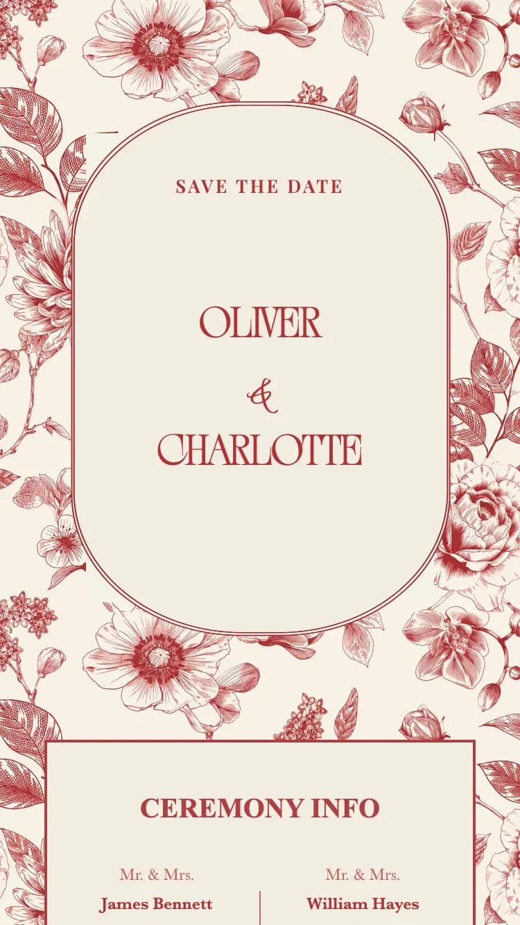
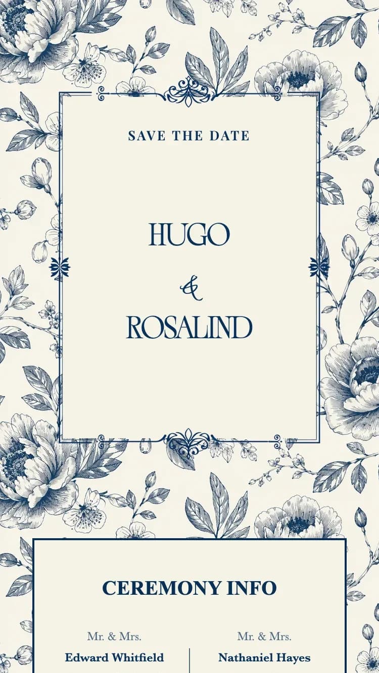
With its powder pink, cream and olive-gold palette the card carries a Royal European poise while staying soft and romantic. If you love floral wedding stationery and want something classic but sweet, this is a natural fit. The same family also offers Porcelain - Blue in navy and Porcelain - Red in a warm red.
Perfect for
Features
- Customizable content
- Unlimited photos
- Google Maps
- Multiple languages
- Guest name display
- Link sharing
- RSVP
- Guest guestbook
FAQ
The first two variants draw their florals in a single ink colour on cream. Porcelain II - Pink uses full-colour painted artwork instead, with blush blooms, olive leaves and gilded tendrils, and its content cards are rounded and softly shadowed rather than square-edged, so the whole card reads gentler and more romantic.
No. All of the content sits on solid cream cards edged in olive gold, so the pattern only shows in the margins and the gaps between cards. Text always sits on a flat cream surface and stays crisp on both phone and desktop.
Yes. The peony sprays tucked against the family, reception and timeline cards drift slowly as you scroll, which adds depth without distracting from the text. The travel is capped, so the motion stays smooth on a phone.
Porcelain II - Pink suits romantic pink weddings, garden receptions, and couples who want a classic character with a soft finish. The blush, cream and olive-gold palette pairs easily with pastel florals and natural styling.
Yes. Porcelain II - Pink supports English, Vietnamese, Traditional Chinese and many other languages. You can enable one or several at once; the invitation text, wedding details and guest wishes all display in the languages you choose.